可変式(レスポンシブ)の横3列ボックスの制作の仕方を紹介します。
「WPで指定した固定ページを3列ボックスで一覧表示」でも似たようなシステムを紹介しました。
今回はまた少し違った方法を紹介します。
PCで見たときには横3列。スマホで見たときには横2列となります。CSSを調整すれば表示方法を変更することは可能です。
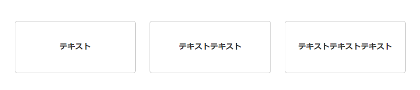
3列ボックスのデモ
実際にどのようになるかというと以下のようになります。
- テキスト
- テキストテキスト
- テキストテキストテキスト
ブラウザの幅を縮めてみると、PCでは横3列で表示されているボックスが2列になることがわかると思います。
3列ボックスのHTML
実際に使用しているHTMLは以下のものです。
<!--▼▼▼横3列ボックス▼▼▼-->

<section class="box3lines">
<div class="box3lines">
<div class="inner">
<div class="list">
<ul>
 	<li>テキスト</li>
 	<li>テキストテキスト</li>
 	<li>テキストテキストテキスト</li>
</ul>
</div>
</div>
</div>
</section>
<!--▲▲▲横3列ボックス▲▲▲-->
3列ボックスのCSS
実際に使用しているCSSは以下のものです。
<style>.box3lines .inner {
width: calc(100% – 50px);
max-width: 1000px;
margin: 0 auto;
padding: 0px 0;
}
.box3lines .title {
color: #fff;
text-shadow: 0 0 12px #000;
font-weight: bold;
text-align: center;
font-size: 36px;
line-height: 1.6;
}
.box3lines .list {
margin-top: 40px;
}
.box3lines .list ul {
display: flex;
flex-wrap: wrap;
justify-content: space-between;
font-size: 18px;
font-weight: bold;
line-height: 1.6;
margin: 0;
padding: 0;
}
.box3lines .list ul:after {
content: ”;
display: block;
width: calc(100% / 3 – 6px);
}
.box3lines .list li {
display: flex;
align-items: center;
justify-content: center;
text-align: center;
width: calc(100% / 3 – 20px);
padding: 38px 20px;
background: rgba(255,255,255,.77);
border: 1px solid #ccc;
border-radius: 5px;
font-size: 85%;
}
.box3lines .list li:nth-child(n+4) {
margin-top: 30px;
}
.box3lines h3 {
    position: relative;
padding: 70px 0px 10px 0px;
    text-align: center;
font-size: 2vw;
font-family: source-han-serif-japanese,serif;
}
@media screen and (max-width: 1400px) {
.box3lines .title {
font-size: 27px;
}
}
@media screen and (max-width: 1270px) {
.box3lines .list ul {
font-size: 16px;
}
.box3lines .list li {
width: calc(100% / 3 – 10px);
padding: 20px 5px;
}
.box3lines .list li:nth-child(n+4) {
margin-top: 13px;
}
}
@media screen and (max-width: 767px) {
.box3lines .inner {
width: calc(100% – 5px);
padding: 10px 0;
}
.box3lines .title {
font-size: 18px;
}
.box3lines .title br {
display: none;
}
.box3lines .list {
margin-top: 20px;
}
.box3lines .list ul {
font-size: 100%;
}
.box3lines .list ul:after {
display: none;
}
.box3lines .list li {
width: calc(48% – 2px);
padding: 15px 7px;
text-align: left;
}
.entry-content .box3lines .list li {
width: calc(47% – 2px);
padding: 15px 7px;
text-align: left;
}
.box3lines .list li:nth-child(n+3) {
margin-top: 4px;
}
.box3lines h3 {
padding: 50px 0px 15px 0px;
    text-align: center;
    font-size: 120%;
    line-height: 30px;
    font-weight: bold;
}
}